
Blog #14
As an artist who thrives on exploring the whimsical relationship between form and space, I'm thrilled to unveil "Fickle Heart." Measuring 24x24 inches, this acrylic on canvas creation invites you into a world where geometric abstraction dances upon a lush green backdrop.
"Fickle Heart" is an exploration of shape and relation—a canvas where vivid geometric designs interact and resonate with each other. Anchored by a hand outlined in black on the right, the hand is adorned with alternating yellow and red stripes, creating a bold focal point amidst the dynamic symphony of elements. Scattered rectangles in deep reds and vibrant oranges make appearances around the canvas, some detailed with crosshatched or dotted patterns, adding layers of intrigue. A triangular form with a muted border and a striking red center offers a new perspective, completing this harmonious interplay of forms.
The inspiration behind "Fickle Heart" was born from a playful curiosity about how shapes relate in a shared space. Each component was thoughtfully placed, challenging both the expected and unexpected interactions. Is there a right place or position? The piece begs the viewer to consider this while the eye wanders through its geometric pathways, encouraging a personal journey through form and color.
Creating this artwork was an engaging experience that allowed not just my hands but my eyes and mind to travel between the shapes. Each brushstroke added depth and texture, unearthing an ever-evolving dialogue that stems beyond static art, offering a living interaction. The result is a rich tapestry of reds, yellows, and greens, contrasted by dark outlines that invite viewers to both admire and question the spatial dynamics within the frame.
In "Fickle Heart," I invite you to lose yourself in its colorful embrace, to pause and consider the significance—or insignificance—of form and placement. May this piece invite contemplation and spark conversations as you find yourself woven into the narrative of shapes and colors. Each glance uncovers new stories and meanings that are as fickle as the heart itself. Allow yourself to be part of this geometric exploration and discover what "Fickle Heart" whispers to you.
Blog # 13.
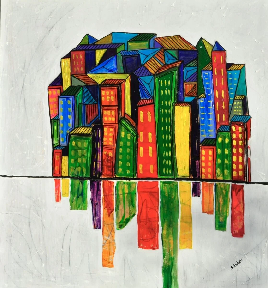
Den City 42.5 × 46h (117×108)
Welcome to the vibrant world of "Den-City," a creation that dances on the canvas with an explosion of colors and geometric intrigue. At 42.5 x 46 inches, this acrylic work on wood panel is a spirited foray into a realm where architecture meets abstraction, offering a feast for the eyes and a journey for the mind.
"Den-City" is a dynamic tapestry of structures—each building bursting with life through a kaleidoscope of blues, greens, yellows, and reds. These hues are not just colors; they are emotions, vibrating with energy and inviting you into a narrative of lively chaos and deliberate order. The vibrant palette sets the stage for a thrilling visual experience, with the reflection of these buildings in symbolic water beneath them, enhancing the depth and harmony of the scene.
Imagine standing within a world where forms are mere suggestions rather than rigid imitations of reality. The abstract nature of each building encourages a voyage into the imaginary, where scale is fluid and interpretation is yours to construct. These designs tug at the whimsical yet maintain a clear boundary with the simpler, subdued backdrop—a dichotomy that intensifies their presence on the scene.
The allure of "Den-City" resides in its fusion of bold, thick lines with intricate patterns, crafted to capture attention while inviting contemplation. It's a symphony of design, where every brushstroke carries intention and each shape vibrates with potential meaning. "Den-City" challenges you to sit, explore its nooks and crannies, and allow its vividness to influence your mood.
Embedded within this composition is my passion for the exploration of form and color. The choice of a whitish background serves to isolate and elevate the buildings, making them appear as if they are springing into existence. It’s this emergence—from the stark simplicity to the complex interplay of color and shape—that provides such allure.
The process of creating "Den-City" was a unique dance between spontaneity and precision—a labor of love meant to evoke both curiosity and delight. With every stroke, there's an open invitation to let your mind wander through this geometric fantasy. Take your time, look closely, and let the meditative quality of the reflection guide you to a space of quiet introspection.
In "Den-City," may you find a landscape teeming with vibrancy and life—a place where you can lose yourself in the orchestrated chaos and discover new perspectives at every glance. Journey through its architectural narrative and allow the transformative power of color and form to lead you to your own imaginative conclusions.

Blog #12
Brollies: A Flight of Fancy in Colors
As I step back to view "Brollies," I'm immediately transported into a scene that feels both whimsical and out of this world. This 24 x 24-inch acrylic piece on masonite board is a vibrant concoction of color and imagination. At its heart are two playful, striped umbrellas positioned on a narrow red path that cuts diagonally across the canvas. It's as if these brollies are caught mid-flight, soaring through a soft, ethereal skyscape painted with gentle, cloud-like whispers that carry the joyful spirit of the composition.
The canvas buzzes with life, where bright reds, blues, yellows, and greens dance in harmony, producing a cheerful energy that invites the viewer to let go, to dream. The umbrellas take on a fluid, curving form at their bases, leading the eye in delightful twists that add a surreal touch to the scene. Their stripes, bold and vibrant, serve not just a visual purpose but are akin to a beckoning whisper, urging you to follow along the dreamlike path I’ve laid before you.
The inspiration behind "Brollies" sparked from a desire to create a lens through which the world appears lighter and more buoyant, reminiscent of gazing through rose-colored glasses. Here, the umbrellas evoke images of sunlit days and carefree moments—a floating testimony to the whimsical aspects of life, a fleeting yet uplifting perspective that elevates one's spirits.
Creating this piece was a breath of fresh air, an escape into a sanctuary built by my imagination. It was about breaking away from the mundane and embracing a playful curiosity that mingles with the clouds above and the bright colors of the earth below. For me, it was a process of dreaming with open eyes, where every stroke of color contributes to a larger tapestry of joy and whimsy.
"Brollies" isn't merely about the visual allure of the umbrellas and their journey across the canvas. It's an invitation to remember the light-heartedness within ourselves, to let our thoughts drift upwards like the umbrellas in the painting. Allow this piece to transport you to a place where reality softens its edges and lets imagination take flight. As you stand before it, may you find that it stirs something within—a new dream, a cherished memory, or simply a smile. Let "Brollies" be a reminder of the beauty in everyday flights of fancy and the colorful paths they lead us down.

Blog #11
Stepping into a world where stories transcend mere words, "Book Building" is a vibrant testament to the endless magic found within the pages of a book. This acrylic on canvas piece, measuring 27.5 x 35.6 inches, invites you to experience a fantastical journey where abstract shapes and bold colors converge to create an unexpected narrative.
The foundation of this artwork is a striking tall blue form, curved and elegant, reminiscent of the spine of a beloved book. It supports an orange bulbous shape and a green rectangular prism, akin to the clustered stories that stand proud on a bookshelf. Each component stacks with an imaginative flair, hinting at the layered complexities we encounter in our literary escapades.
Imagine sitting under your sun umbrella reading your favourite novel, "Book Building" brings a sense of whimsy and celebration, echoing the delightful surprises found within our favorite books. The scene is set against a backdrop of gradient yellow tones, transitioning from rich to light, much like the transformative journey of a narrative unfolding before our eyes.
The inception of this piece arose from a personal odyssey through the literary world. As I devoured book after book, I found myself inhabiting their worlds, much like living within a "Book Building" itself. This artwork stems from the desire to capture that essence—of dreaming within stories and escaping into realms crafted by words.
Creating "Book Building" was a lesson in embracing the journey over the destination. It was a dance between control and freedom, where each shape gradually revealed itself, much like the plot twists of a gripping novel. The artwork guided me, unveiling paths I hadn't anticipated and encouraging me to trust the narrative being crafted by the forms and colors.
In the realm of "Book Building," I invite you to explore these vibrant shapes as though they were chapters of an unwritten story, each one beckoning you to pause and ponder. Let your imagination roam free among this delightful construction of color and geometry; find the stories hidden within the playful pennants and vivid hues.
Allow "Book Building" to be your escape, your playful muse, inviting you to lose yourself in its architectural beauty and find new tales around every vibrant corner. Here, the pages of imagination await to unfold into endless adventures.

Blog # 10
Fall in the Highlands: A Journey Through Vibrant Landscapes
As an artist, I often find inspiration in the natural world’s ever-changing beauty, and my latest artwork, "Fall in the Highlands," is no exception. Crafted with acrylic on a 24x24-inch canvas, this piece captures the essence of an autumn day that beckons adventure and introspection alike.
In "Fall in the Highlands," I sought to depict more than just a landscape; I wanted to create a vivid dialogue between viewers and nature. The scene presents a meandering path that invites you to traverse through a forest ablaze with autumn’s fiery tones. From bold reds and oranges to the warm embrace of yellows, each color is meticulously chosen to reflect the season's dynamic spirit. These lively hues are contrasted with calming greens and blues, bringing the composition into a harmonious balance reminiscent of a blustery autumn day.
The unique aspect of this piece lies in the portrayal of the leaves. They are not the conventional shapes one might expect. Instead, they take on a dot-like form, their roundness adding a playful, almost whimsical touch. This technique enlivens the scene, inviting the viewer to linger on each branch and trunk, which serve as digital brushstrokes guiding the eye through the canvas’ energy.
However, the path within this vibrant forest doesn’t merely guide one's physical sight. Symbolically, it leads to a hilltop, subtly breaking away to the left—a departure to the unknown, a moment captured in motion, as if the wind might lift you along the journey. Above, the sky completes the narrative in a theatrical display of color. A blend of blue, white, and myriad tones, symbolizes movement and vitality, underscoring the painting’s overall theme of a restless yet exhilarating autumn day.
To create this artwork, I embraced the creativity sparked by nature’s singular designs, picturing a landscape not bound by traditional leaf shapes or subdued tones. The powerful skies and abundant clouds further reflect this commitment to capturing nature’s unpredictability and beauty.
In "Fall in the Highlands," I invite you to step into an imagination-fueled forage of discovery where every leaf, sky, and path has a story to tell. Whether you're an art enthusiast or simply a lover of nature, this artwork promises an evocative experience of autumn’s vibrant allure.
Blog #2
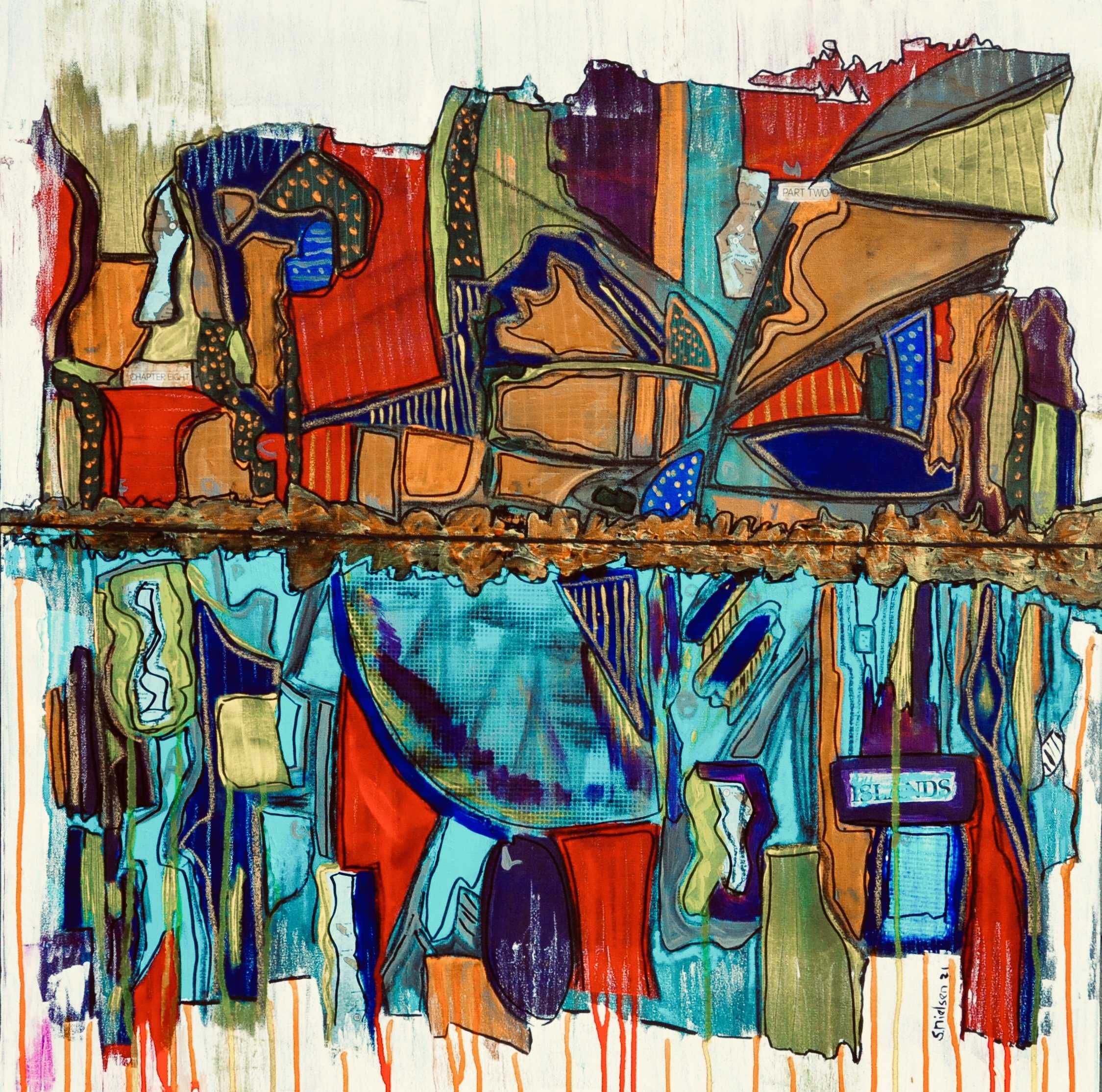
In my 2021 work, "Theme Park," I embark on a vibrant artistic journey where abstraction meets emotion. This 36" x 36" acrylic masterpiece unfolds across a canvas alive with movement and color, a reflection of the never-ending hustle and bustle of one of my favorite inspirations—theme parks.
"Theme Park" is a dynamic exploration of color, form, and texture. The artwork is divided into two distinct yet interconnected sections, a visual metaphor for the constant activity and duality often found in theme parks. The upper segment bursts with warm, inviting hues of red, orange, and yellow. It is a lively dance of shapes and patterns that evoke a sense of organic vitality. It's as if the rich, swirling colors capture the joyful chaos and energy that pervade the atmosphere of a theme park.
Contrasting this vibrant flurry, the lower section descends into cooler, more tranquil pools of blues and greens. Drips and fluid shapes suggest a reflective underwater world, offering a moment of respite and calm—a balance to the excitement above. The interplay between these vibrant and serene elements is anchored by a bold horizontal line, a textured thread that stitches the narrative together, providing a sense of unity and grounding.
What's particularly captivating about "Theme Park" is how it harmonizes chaos and tranquility, a testament to the delicate balance achieved through its composition. Despite the riot of colors and shapes that might otherwise provoke chaos, there's an underlying harmony that draws you in and holds your gaze. This intricate balance is where the magic of this piece truly resides—it's a dialogue between movement and stillness, energy and calm.
Creating this artwork was an exciting process, a chance to dive into the movement and diversity of a theme park's environment and challenge myself to capture it on canvas. The theme of dual sections, reminiscent of a park divided by water, allowed me to explore how these spaces coexist and interact. I find myself eager to further experiment with this relationship, considering how transitions can be softened or how textures might vary to deepen the narrative even more.
Ultimately, "Theme Park" is an invitation for viewers to immerse themselves in the vibrancy and complexity of an imaginative world, filled with its own rhythm and vitality. It’s a love letter to the joys and wonders of both theme parks and art, showcasing the endless possibilities when color and form collide. As I continue to explore these themes, I look forward to the new directions they might lead me—each work a new chapter in an ever-evolving story of creativity.

Blog #9
Every time I paint, I seek to explore new landscapes of imagination, and my latest piece, "Windy Days," is no exception. This artwork, measuring a vivid 39x31 inches (103x80 cm), unfolds on acrylic canvas, inviting you into a surreal world dominated by vibrant colors and whimsical forms.
Picture a landscape where the ordinary elements are reimagined. Across the canvas stretch bands of dynamic color, gracefully curved and supported by vertical poles. Each band is an explosion of hues, transforming the space into a lively dance of color. The highlight of this fantasy scene comes alive on the top-most red band where green trees, dotted with red spots, stand at attention, rooted not in the earth but afloat in the airy embrace of altitude.
The sky, a mesmerizing interplay of blues and whites, pairs effortlessly with the luminous quality of the scene, crafting an atmosphere bursting with life and whimsy. It's as if each element is caught in a playful breeze, daring gravity with a charismatic ease. The bold outlines and radiant colors infuse a feeling of light-hearted charm and unfettered imagination.
The inspiration behind "Windy Days" sprouted from my desire to create a surreal portrayal of nature—a vision where trees find stability through the curves of floating color boards. My intention was to play with the dichotomy of stability and instability in this dreamlike setting, where wind seems to join in the artistic expression, guiding each hue and form along its path.
The unique process orbits around the juxtaposition of dreams and reality, with trees waving in the wind at surprising heights, yet confidently holding onto their fruit. It’s this unlikely adventure, this atypical harmony that breathes life into the scene. Each tree, suspended and swaying, reflects a balance between control and freedom, stability and whimsy.
"Windy Days" invites you to meander through its colorful curves, to feel the gentle sway of trees anchored in the sky, to embrace the vibrant interplay of elements that defy expectation. As you gaze upon its expansive canvas, I hope you find yourself caught up in the vivid whimsy of a world where possibility floats just above the ground, anchored only by the imagination.

Blog #8
Introducing "Mirror Mirror," a captivating exploration of geometric abstraction. This 30x30 inch piece, crafted with acrylic on canvas, presents a vibrant world of form and color that evokes curiosity and reflection.
"Mirror Mirror" showcases a dynamic grid of rectangles and squares, each defined by bold red and blue outlines of varying thickness. These frames create an energetic flow, while muted tones inside offer striking contrast, making each section stand out while maintaining harmony.
The background enhances the geometric forms with vertical, textured stripes in softer, blended hues, adding depth without overshadowing the foreground. The interplay of calculated and serendipitous elements captures both the eye and the imagination.
The vision for "Mirror Mirror" was inspired by framed mirrors linked by bold red lines, symbolizing reflection and interconnection. This imagery beautifully translated onto the canvas, inviting exploration of the relationships between shapes and colors.
Creating "Mirror Mirror" was a journey that highlighted the intersection of art and design. Its bold colors and defined shapes make it ideal for adaptation across various forms, such as pillows, adding versatility and depth beyond traditional canvas art.
In "Mirror Mirror," discover a narrative of symmetry, balance, and the allure of bold contrasts. Each glance reveals interactions between shape and color, inviting you to find your own reflections within its lines and spaces.

Blog#7
I'm thrilled to share "Chaos in Blue," a dynamic exploration in acrylic on canvas measuring 36 by 48 inches. This artwork resonates deeply with my journey through the remnants of 2021, a time where chaos seemed to linger as a familiar companion.
"Chaos in Blue" comes alive through an engaging interplay of abstract shapes and vibrant colors, mainly focusing on blues, yellows, and oranges. The brushwork is deliberate, with sharp lines leading the viewer's eye in multiple directions, creating layers that promise endless exploration. At the heart of the composition is a swirling interaction of forms, evoking a sense of movement and depth that feels almost kinetic.
Creating this piece was a unique process. Despite the chaos depicted, there's an inherent calmness that emerges—a duality that offers both tension and resolution within the same canvas. It's a testament to the harmony found in contrasts, encouraging a personal dialogue between viewer and artwork. The colors and forms don't just define the piece; they open up a myriad of interpretations, inviting you to connect with your own story.
One aspect I'm contemplating for future endeavors is the balance between chaos and tranquility. Introducing areas of visual rest, perhaps through strategic negative space or softer color palettes, might amplify the dynamic elements even further. I'm also considering the potential of incorporating varied textures to add depth and invite tactile engagement.
With "Chaos in Blue," I aimed to capture a snapshot of the world we found ourselves in—a world teetering between the familiar and the unpredictable. It challenges me to reflect and pushes me to explore the endless possibilities of abstract expressionism. I hope this piece not only captivates your eye but also resonates with your own experiences, sparking new interpretations each time you engage with it.
Dive into this composition and see where the journey of chaos and calmness leads you.

Blog #6
On Fire is a dynamic artwork that embodies the raw energy of abstraction. Measuring 24 inches by 48 inches, this piece is crafted with acrylic paint on masonite board, offering a sturdy canvas for a symphony of bold colors and flowing forms. Priced at $1500.00 Cdn, the artwork is a vivid tapestry of vertical streaks, where fiery reds, yellows, and oranges blaze across the board. These energetic lines cut through a vibrant backdrop of calming blues, greens, and lighter shades, inviting the viewer to engage with the interplay of hues. Each layer overlaps and melds with the next, crafting an electrifying narrative where movement and chaos seem to dance in tandem.
This composition stems from my fascination with the contrast between red and teal hues and how these colors interact in unpredictable ways. It’s a visual exploration of how colors converse across the canvas, a dialogue that is both harmonious and dissonant. The red lines are fiery, filled with vigor, while the teal backdrop offers a soothing counterpoint, creating a balance that resonates with those who take the time to trace the lines as they dive and intersect.
The process of creating On Fire was a unique journey. The choice of masonite board as the medium offered an exciting challenge, allowing me to experiment with texture and layering to enhance the intensity of the colors. The tactile surface invited a dynamic application of paint, enabling each streak and hue to find its own path and rhythm.
On Fire is more than a static image; it’s an experience—a bold exploration of color and movement that invites you to get lost within its strokes. I hope as you stand before this work, you feel its warmth and vibrancy and let it spark your imagination. Let your eyes traverse the chaotic dance of streaks and rest in the tranquil currents of teal, discovering your own narrative within its vibrant chaos.

Blog#5
Exploring the Vibrant Essence of "My Hometown"
As an artist, I'm exhilarated to share my art with you: "My Hometown." This artwork, measuring 39.5 x 31.5 inches (100 x 80 cm), $1495.00 cdn is a dynamic journey into abstract expression, rendered vividly in acrylic on canvas. It's been a rewarding exploration of color, shape, and meaning, intended to capture both the essence and emotion of a place familiarity.
"My Hometown" stands as an energetic composition filled with a symphony of geometric shapes and bright colors. In crafting this piece, I aimed to infuse it with life and movement exclusively through visuals. The canvas is alive with overlapping triangles and rectangles, dressed in vibrant shades of green, blue, red, yellow, and purple. These elements come together to create a harmonious yet energetic dance across the canvas.
Dominating the artwork is a central diagonal band of blue brushstrokes, intentionally fluid against the structured geometry. This contrast introduces a river-like element that metaphorically splits the composition into two parts—suggestive of water dividing the town. This diagonal band not only adds a soothing, flowing aspect but also challenges the viewer to interpret the juxtaposition of stability and movement.
The inspiration behind "My Hometown" is deeply personal. I envisioned the cityscape abstractly, where houses take the form of triangles and squares, creating a playful yet insightful look at urban landscapes. This abstraction allows the viewer to experience the familiar in an unfamiliar way. The water, which seems to split the town, represents the rivers or inlets that define the geography of so many cities, including my own.
One unique aspect of bringing this piece to life was the challenge of portraying division and unity simultaneously. The chaotic arrangement of forms feels balanced by the calming influence of the "river," highlighting the duality of urban life—often chaotic yet soothing when viewed from a distance.
"My Hometown" invites you to experience the playful balance between organized chaos and serene order through color and form. It's a visual conversation on how we perceive and sentimentalize our environments, abstracted into vivid expression. I hope as you gaze upon it, you too find a piece of your own story within its lively composition.

Blog #4
Welcome to a vivid exploration of forms and colors with a piece aptly titled "Warm Flight." Measuring 31 inches by 40 inches, this multimedia work marks a new chapter in the journey as an artist—a dive into the universe of abstract painting where shapes, colors, and lines unite to create a symphony for the eyes.
"Warm Flight" is a vibrant testament to the beauty of abstract expression. The piece features a bold interplay of geometric and organic forms, including triangles, rectangles, circles, and irregular shapes, each playing a unique part in the overall composition. The color palette is nothing short of electrifying, with dominant hues of red, blue, green, yellow, and black. These colors are not just there to catch your eye; they speak, they sing, and, most importantly, they invite you into a world where energy and emotion meet.
One of the most striking aspects of this artwork is its energetic quality, brought to life by the use of bold outlines and diverse textures. The background isn't merely a backdrop; it's a living, breathing part of the artwork, filled with striped patterns and drips that create a captivating sense of movement and depth. Several sections of the painting are densely filled with intricate details, like dots and lines, which add layers of complexity and invite the viewer to linger and explore.
The inspiration behind "Warm Flight" was to allow viewers to engage with layers, shapes, and forms without any preconceptions. Painted during the COVID pandemic, a time that was dark and depressing with little hope for the future and what it would look like, gloom and despair seemed to be the order of the day, which could answer a few questions of "why this painting now." It's about offering an open invitation to step into a realm where there's no right or wrong interpretation. The aim was for viewers to pause, to reflect, and to connect with the piece on their individual terms.
The creation of this artwork involved a unique process of layering and experimentation. It was an exercise in allowing the piece to evolve naturally, making space for spontaneity while maintaining a harmonious composition. The result is an artwork that truly makes you stop and take note, providing a rich visual experience that keeps unfolding the more you look.
"Warm Flight" isn't just a painting; it's a journey—a warm invitation to fly through layers of creativity and imagination. It is hoped that it resonates with you as much as it did in its making.
Blog #3
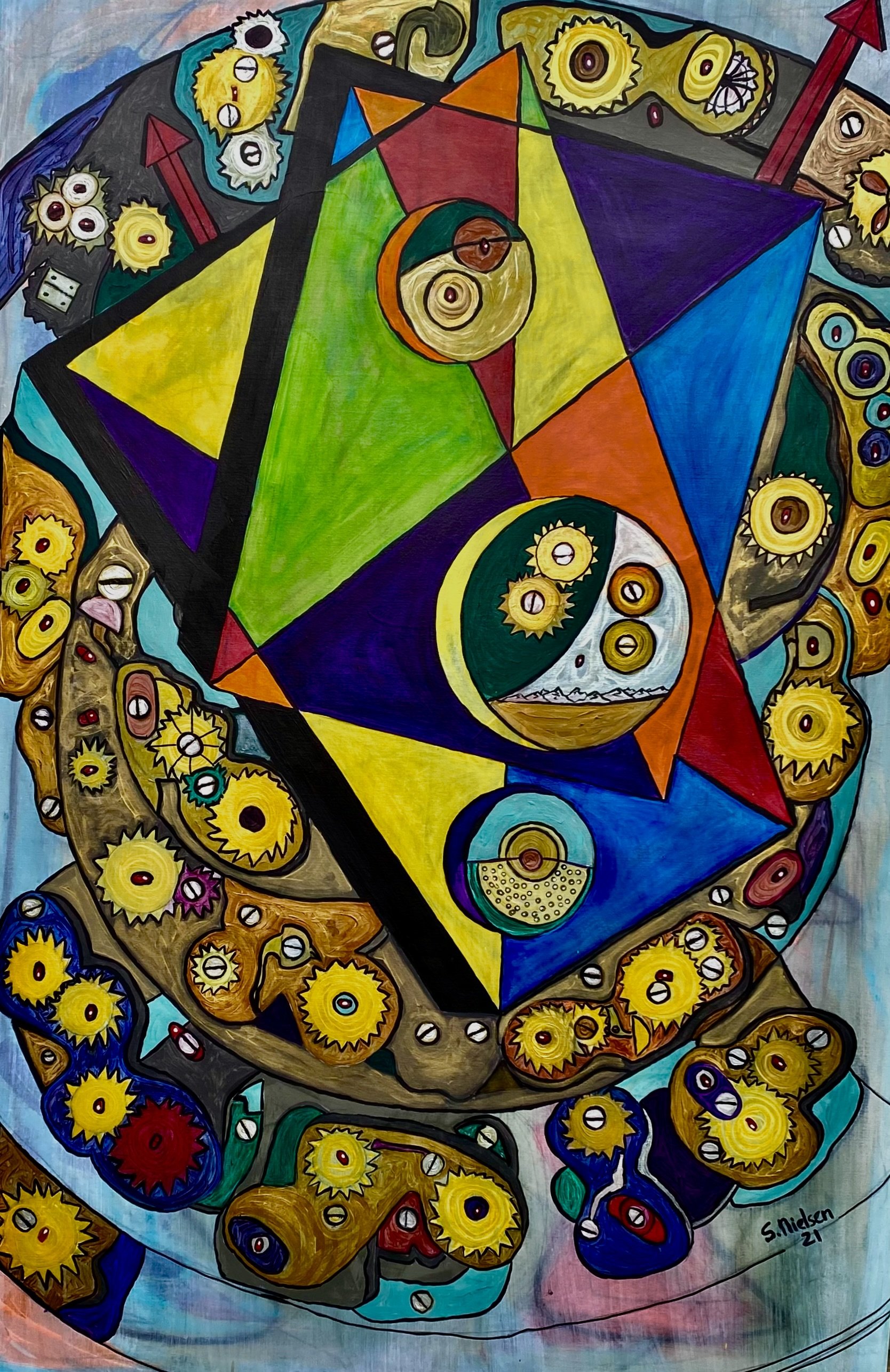
"Inner View" stands as a vibrant testament to my ongoing fascination with abstraction and mechanical wonders. This latest creation, a sizable 48x72-inch acrylic work on canvas, invites you to embark on an exploration of colors, shapes, and the interplay between the two.
Picture this: a central triangle dominating the canvas, its presence subdivided into a patchwork of bold, fantastic hues—green, blue, purple, orange, and black. It’s as if each section pulses with its own rhythm, telling a separate story while contributing to the whole. Within and surrounding this triangle, you’ll find circular, eye-like designs—yellow, white, and more—that introduce texture and a sense of motion that keeps the eye perpetually engaged.
As your gaze continues to wander, you'll notice the swirling patterns that animate the background, filling the canvas with energy and lending an atmosphere that almost hums with kinetic potential. It’s easy to imagine this piece as an interior look at a clock, each shape hinting at gears and cogs in perpetual motion.
The inspiration for "Inner View" roots itself in my curiosity about the inner workings of clocks—a fascination with their precise mechanics and the symphony of movement they orchestrate. Creating this piece was an exhilarating process, one that required me to envision potential movements in front of me, allowing my imagination to animate these brightly colored forms. This wasn’t simply about translating inspiration onto the canvas; it was about distilling movement and energy into a static form that nonetheless vibrates with life.
What sets "Inner View" apart in my artistic journey is this very exploration of motion within stillness. As you stand before the artwork and let your eyes traverse its bold forms, I hope you find yourself transported, even momentarily, into the intricate dance of abstract mechanics at play.
Through "Inner View," I extend an invitation to you. Let your eyes linger on the canvas. Imagine the intricate dance of timepieces, the harmonious grind of cogs working together in harmony. Perhaps you’ll uncover new perspectives, new stories woven into the rich tapestry of colors and shapes—journeys waiting to be discovered with each viewing.

Blog #1
Burial Forest 2023 24×24”(61×61 cm) $1075.00 Cdn
Burial Forest: A Journey into Geometric Abstraction
As an artist, I find inspiration in the endless possibilities of shape, color, and texture. My latest artwork, "Burial Forest," is a testament to this fascination, inviting viewers to explore a vibrant abstract landscape. This 24 x 24-inch piece, crafted with acrylic on a wood panel, showcases a complex interplay of geometric forms layered meticulously across the canvas.
"Burial Forest" features an engaging array of triangles and rectangles, each filled with intricate circular patterns and dots. The canvas bursts with bold hues of yellow, pink, blue, and green, bringing each shape to life. These lively elements seem to dance against a richly textured backdrop composed of darker reds, purples, and browns. This stark contrast between foreground and background is instrumental in creating the dynamic sense of movement and depth that I aimed to achieve.
The inspiration behind "Burial Forest" stems from my love for multilayered compositions that captivate the viewer's attention and fuel the imagination. The eye-like shapes scattered throughout the piece invite onlookers to delve deeper, uncovering a milieu of forms that may resemble animals or abstract figures, depending on one's perspective. It's this diversity in interpretation that I find truly remarkable—how an artwork can simultaneously tell multiple stories.
Creating this piece was a unique journey, driven by a need to balance an interesting foreground with an integrated yet complex background. My goal was to construct a visual narrative that draws the observer in, encouraging them to explore and reflect on the intricate relationships between color, form, and texture.
Through "Burial Forest," I hope to offer a visual retreat where imagination can flourish amidst a symphony of geometric patterns and vivid colors. It is an invitation to pause, observe, and become enveloped in the abstract, ever-changing dance of shapes and shades that defines the heart of this artwork.
Burial Forest 2023 24x24” (61x61 cm) $1075.00 CDN
Burial Forest: A Journey into Geometric Abstraction
As an artist, I find inspiration in the endless possibilities of shape, color, and texture. My latest artwork, "Burial Forest," is a testament to this fascination, inviting viewers to explore a vibrant abstract landscape. This 24 x 24-inch piece, crafted with acrylic on a wood panel, showcases a complex interplay of geometric forms layered meticulously across the canvas.
"Burial Forest" features an engaging array of triangles and rectangles, each filled with intricate circular patterns and dots. The canvas bursts with bold hues of yellow, pink, blue, and green, bringing each shape to life. These lively elements seem to dance against a richly textured backdrop composed of darker reds, purples, and browns. This stark contrast between foreground and background is instrumental in creating the dynamic sense of movement and depth that I aimed to achieve.
The inspiration behind "Burial Forest" stems from my love for multilayered compositions that captivate the viewer's attention and fuel the imagination. The eye-like shapes scattered throughout the piece invite onlookers to delve deeper, uncovering a milieu of forms that may resemble animals or abstract figures, depending on one's perspective. It's this diversity in interpretation that I find truly remarkable—how an artwork can simultaneously tell multiple stories.
Creating this piece was a unique journey, driven by a need to balance an interesting foreground with an integrated yet complex background. My goal was to construct a visual narrative that draws the observer in, encouraging them to explore and reflect on the intricate relationships between color, form, and texture.
Through "Burial Forest," I hope to offer a visual retreat where imagination can flourish amidst a symphony of geometric patterns and vivid colors. It is an invitation to pause, observe, and become enveloped in the abstract, ever-changing dance of shapes and shades that defines the heart of this artwork.